HomeStreet Bank Rebrand
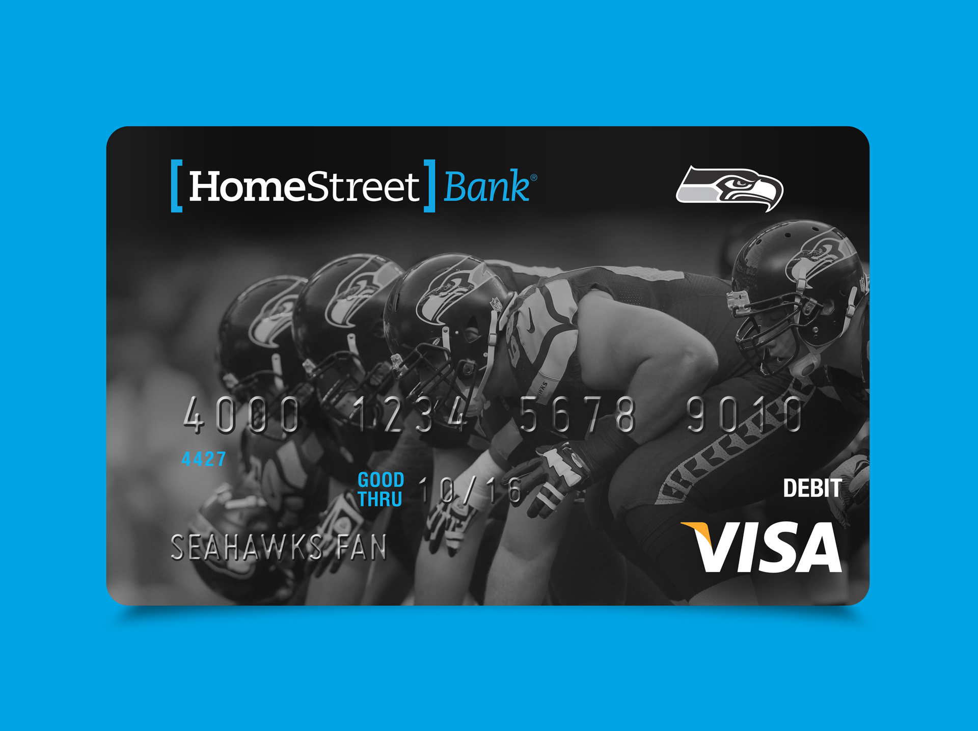
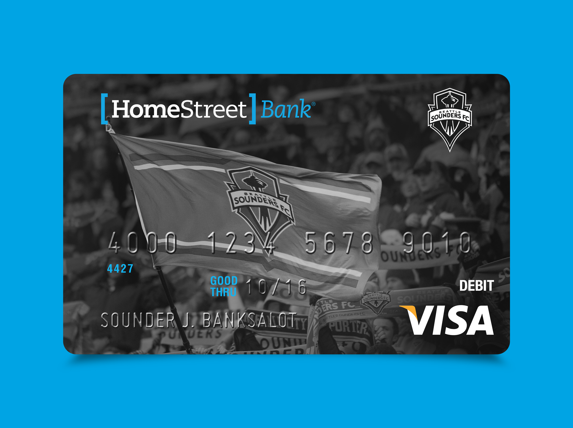
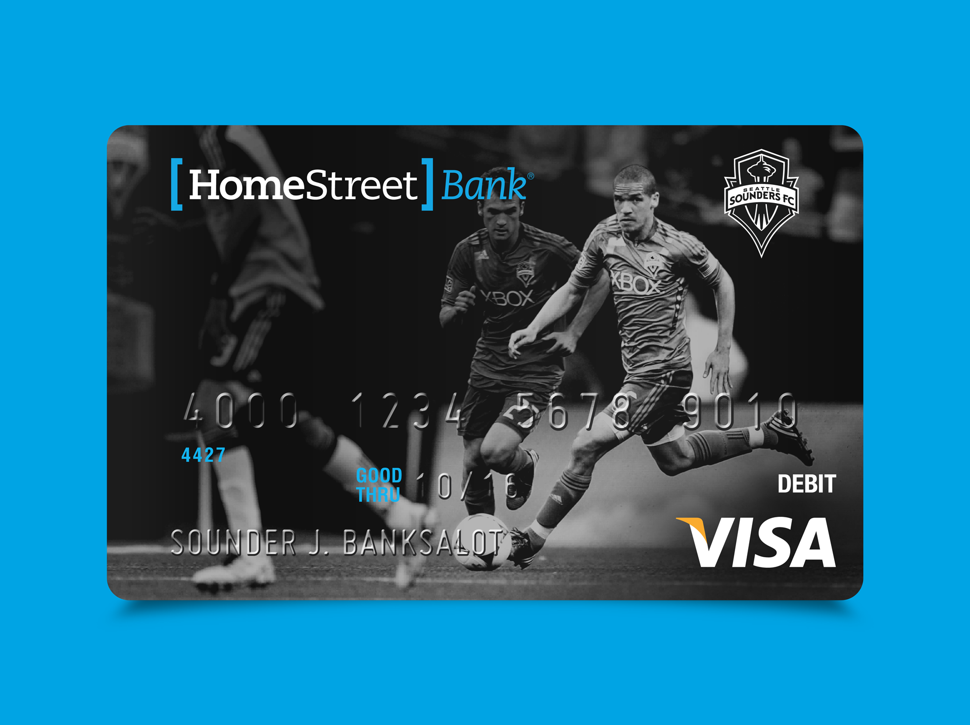
For decades, HomeStreet Bank had been known for being the “friendly local bank”, and while that’s great, they needed to grow up. Legitimacy and security were their new brand aspirations, so the use of brackets, slab serif type and blue & black color palette helped achieve that goal.
client: HomeStreet Bank
media: all
role(s): art direction + design
industry: finance
market: regional