Dragon’s Milk: Raid the Dragon’s Hoard
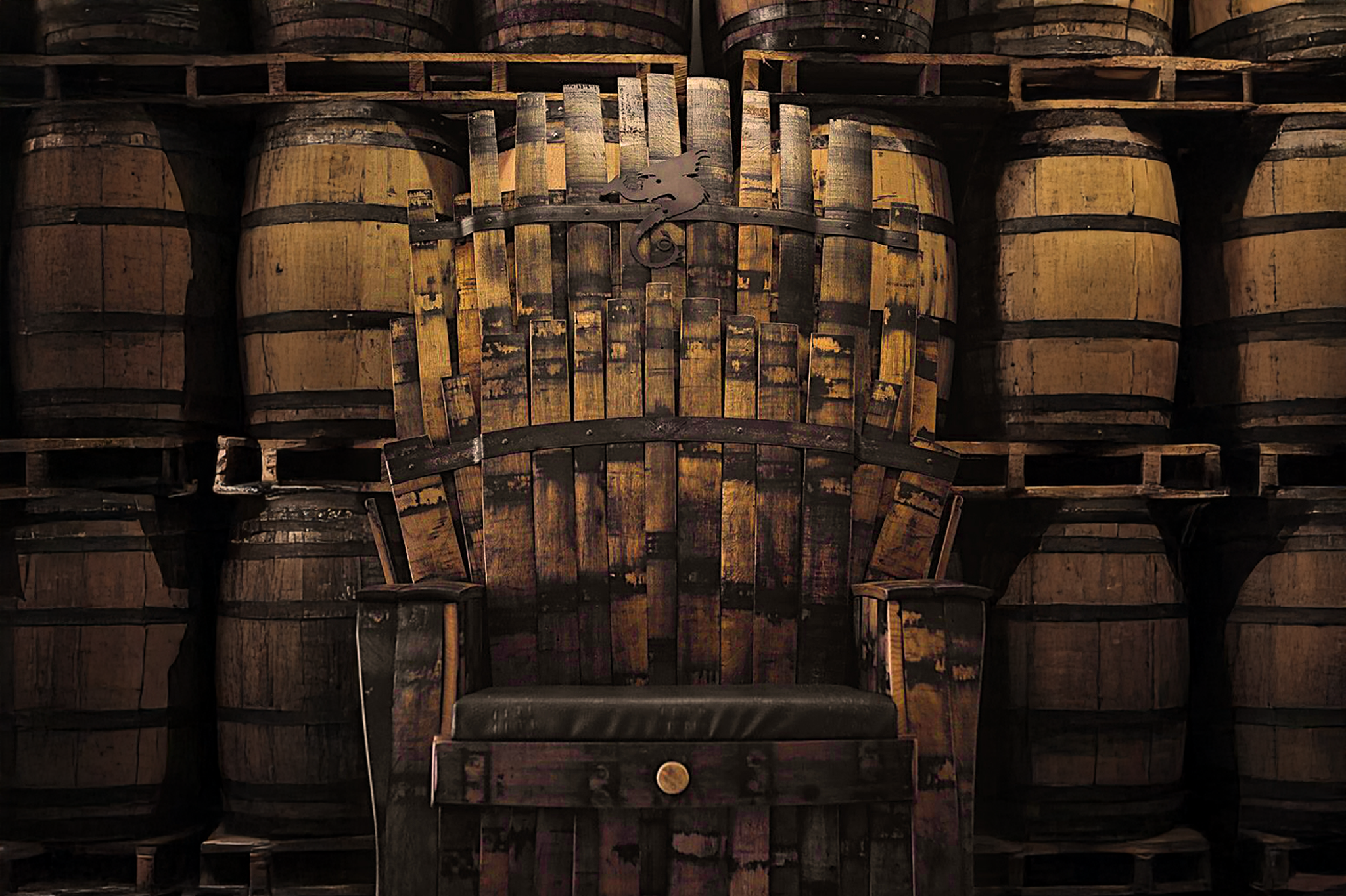
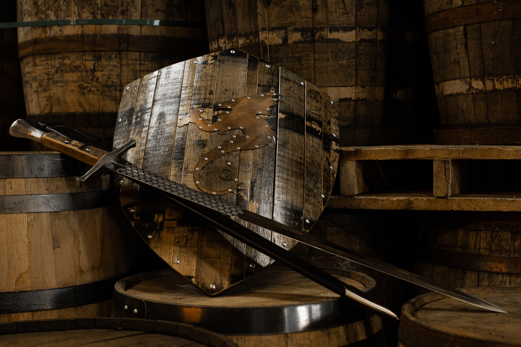
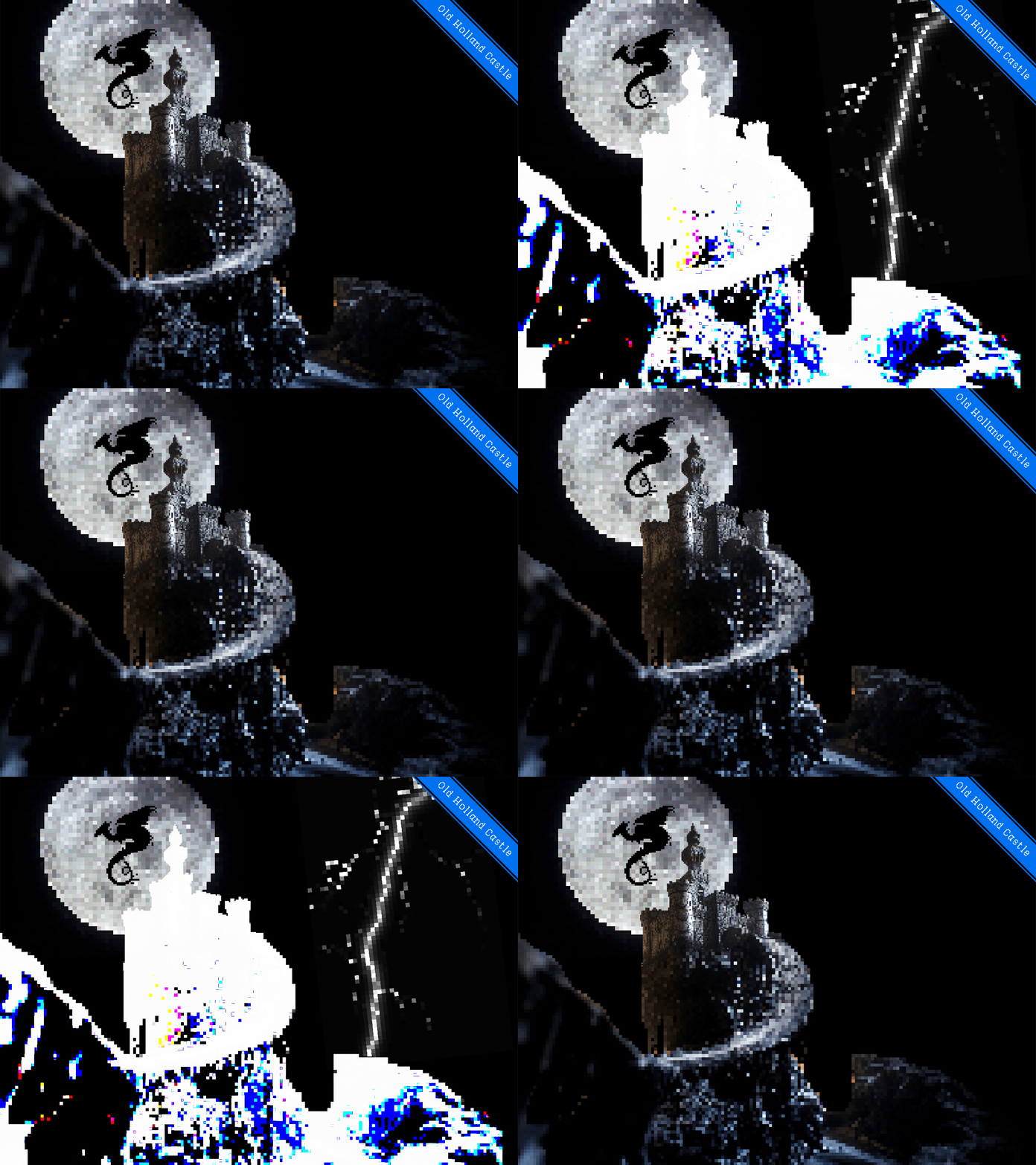
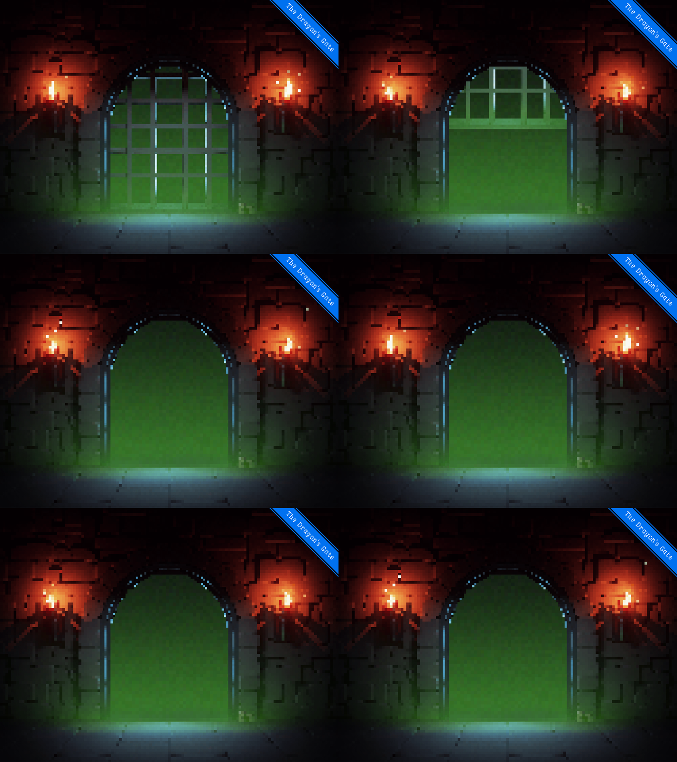
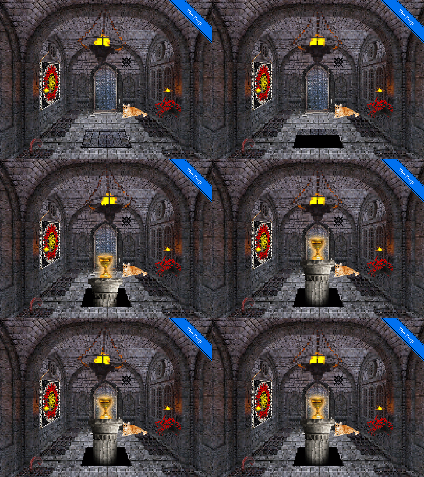
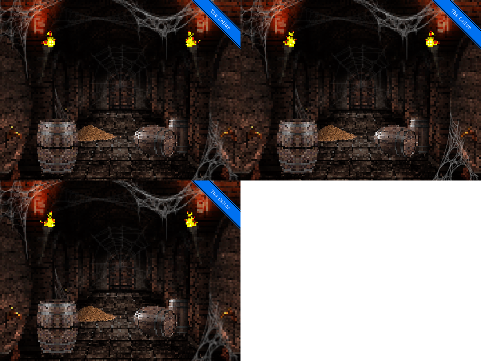
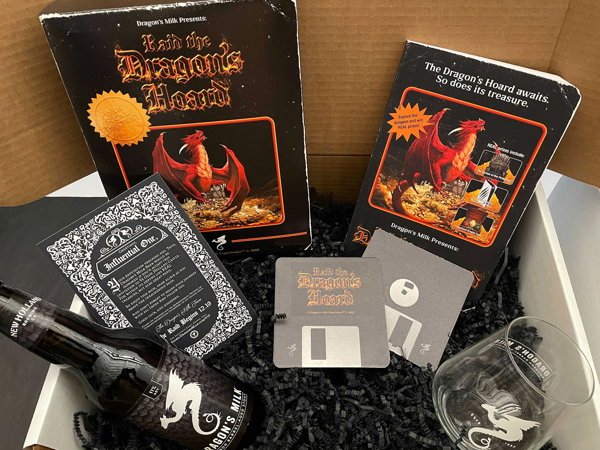
New Holland Brewing’s amazing Dragon’s Milk Stout team came to us with a dream brief: “Appeal to their hardcore audience and give them an experience to remember. Make a lasting emotional brand impression that they will share with their friends.”
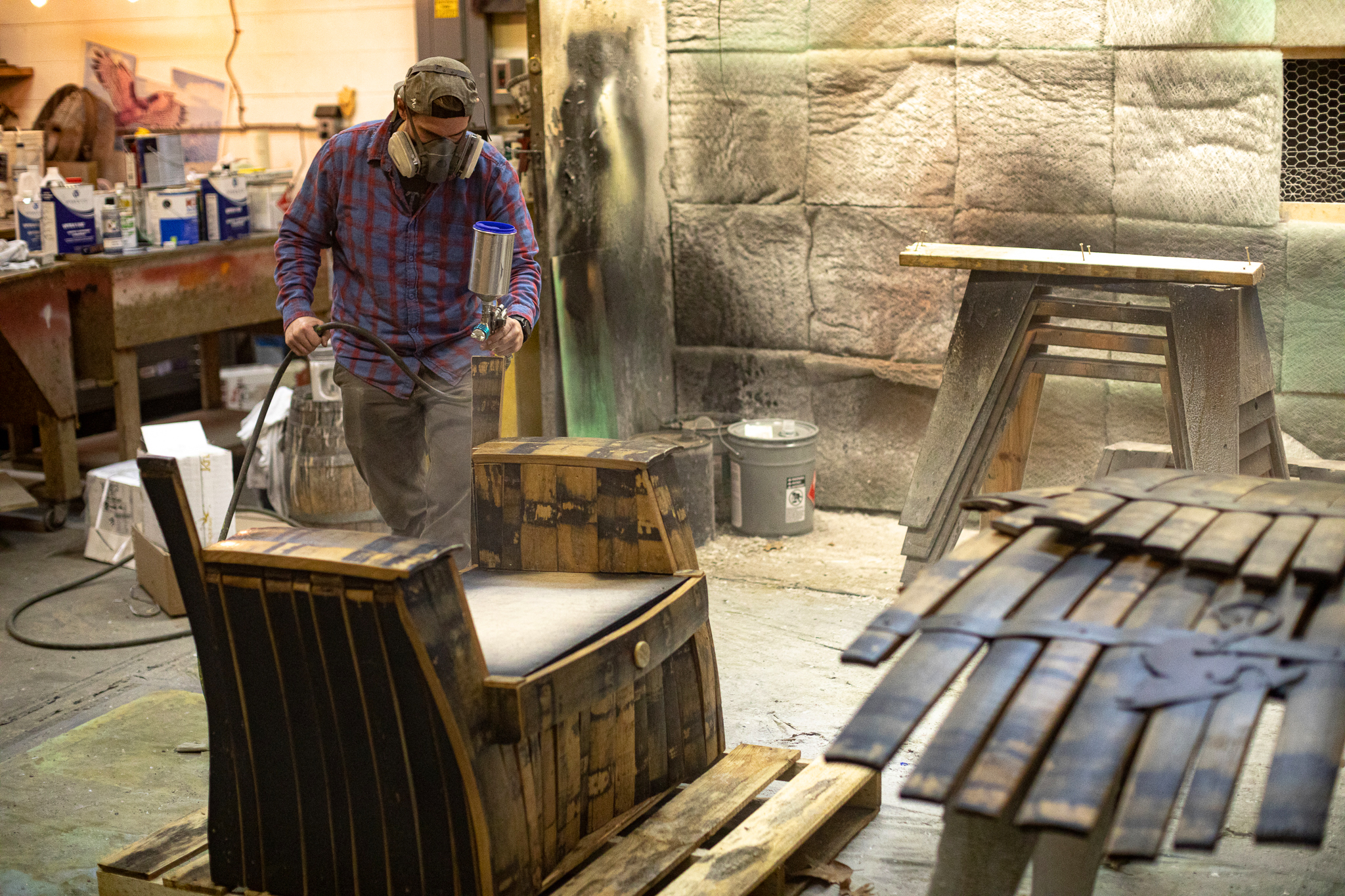
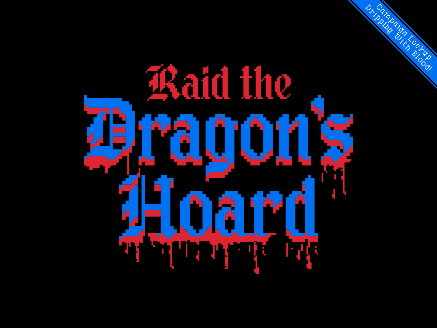
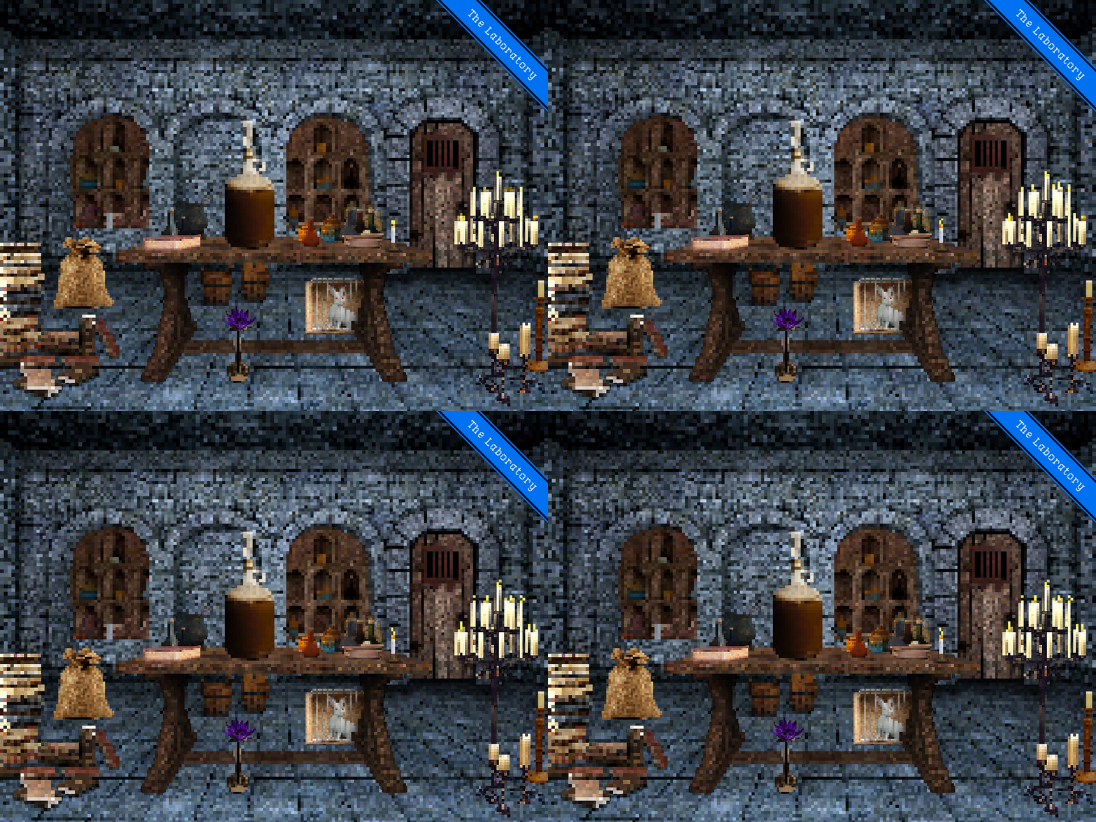
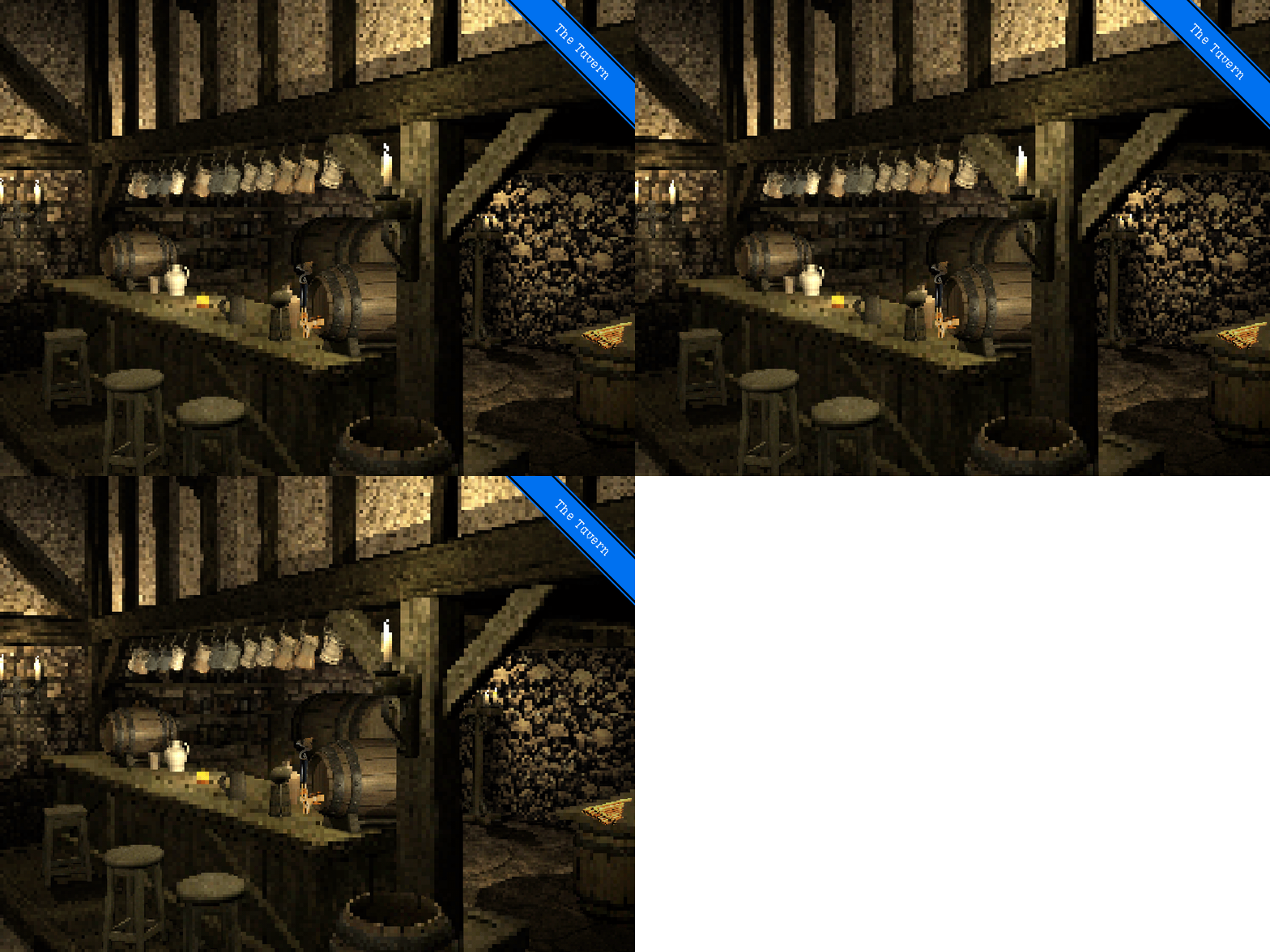
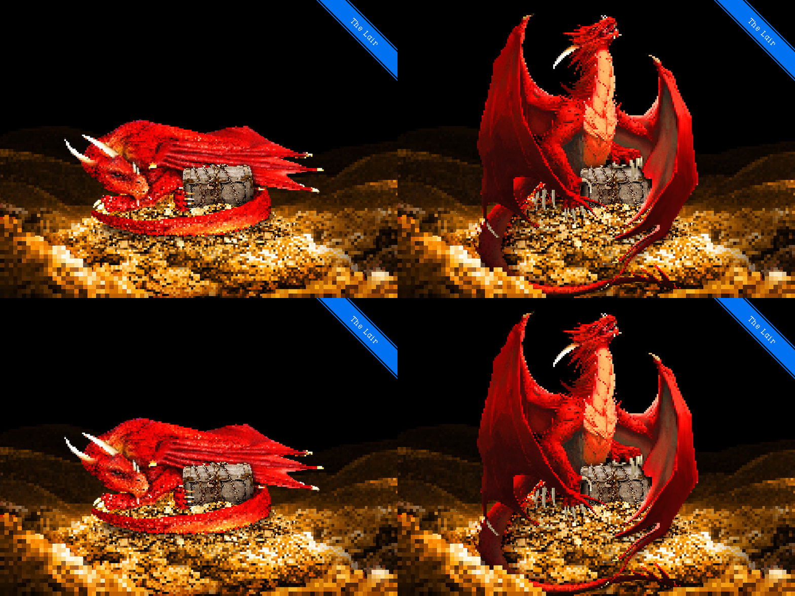
Strategy and research found Dragon’s Milk super fans overwhelmingly enjoyed things like retro gaming, fantasy content and tabletop RPGs. So we created a fully custom web game in which you played for the chance to win REAL IRL prizes.
Strategy and research found Dragon’s Milk super fans overwhelmingly enjoyed things like retro gaming, fantasy content and tabletop RPGs. So we created a fully custom web game in which you played for the chance to win REAL IRL prizes.
client: New Holland Brewing, Dragon’s Milk Stout
media: interactive web game, social
industry: beverage
market: national
role(s): ACD—art direction, game-design, game-dev (prototype), pixel art
media: interactive web game, social
industry: beverage
market: national
role(s): ACD—art direction, game-design, game-dev (prototype), pixel art



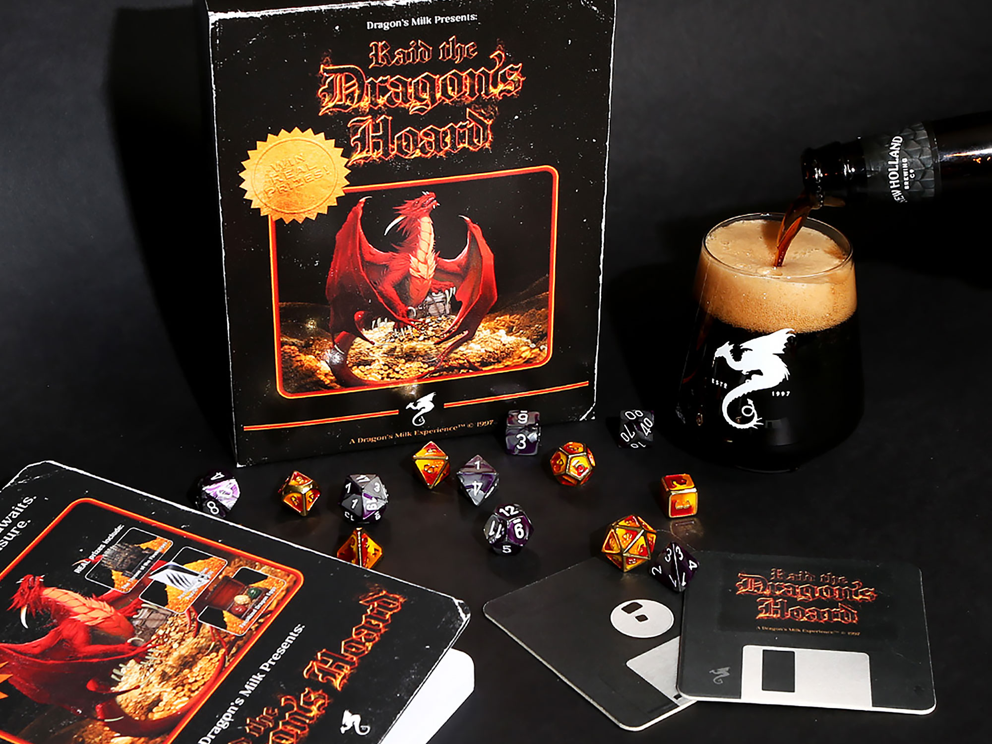
Influencer Package
Case Study
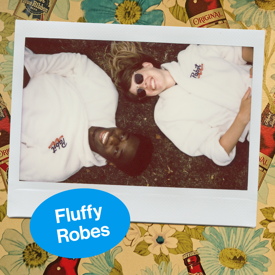
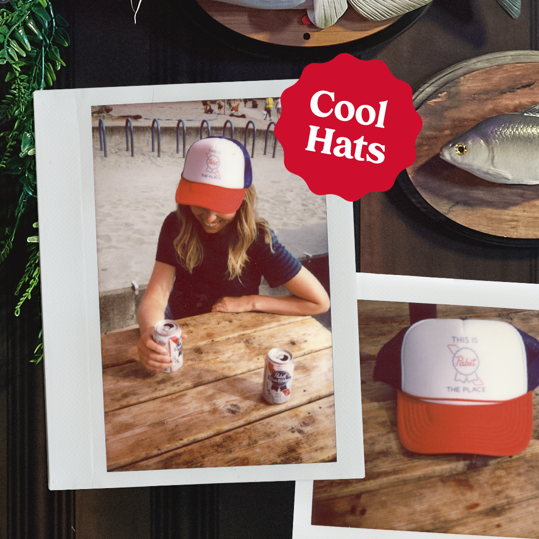
Pabst: This is the Place
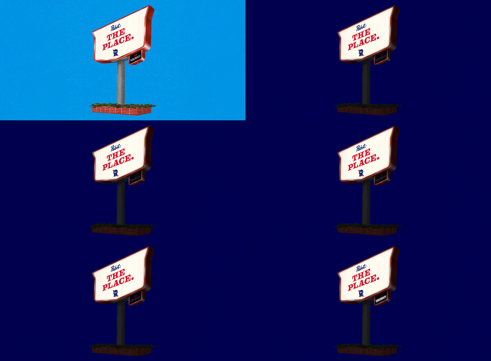
Pabst Blue Ribbon has a rich, storied history and an undeniable “cool factor” but had lost relevance with their younger audience. Something that they indexed highly for was nostalgia, so we leaned into that full-tilt. Enter: This is the Place. A magical place where time doesn’t exist. A place where a tortoise named Tank unapologetically wears a miniature cowboy hat. A place where fun is cheap and a good time is simply a 6-pack away.
client: Pabst Blue Ribbon
media: broadcast video, OLV, DTV, OOH, social, activation
industry: beverage
market: national
role(s): ACD—art direction, design, production hand, talent
media: broadcast video, OLV, DTV, OOH, social, activation
industry: beverage
market: national
role(s): ACD—art direction, design, production hand, talent


Social Posts


Pabst: The Place, Activation
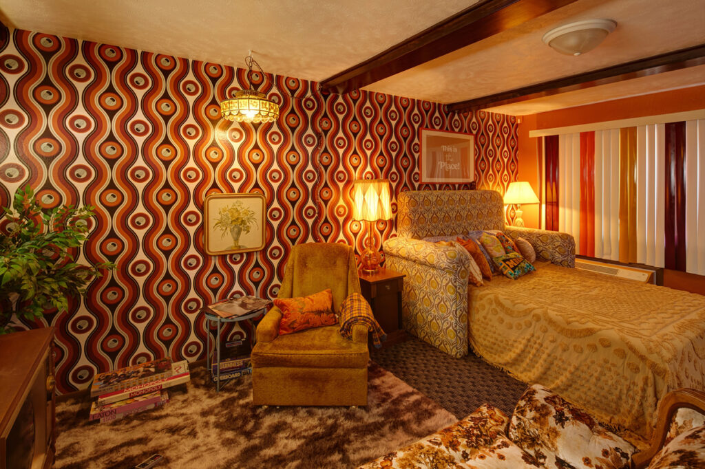
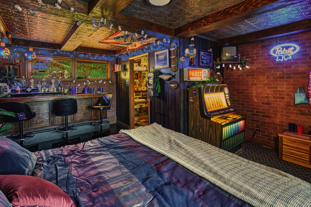
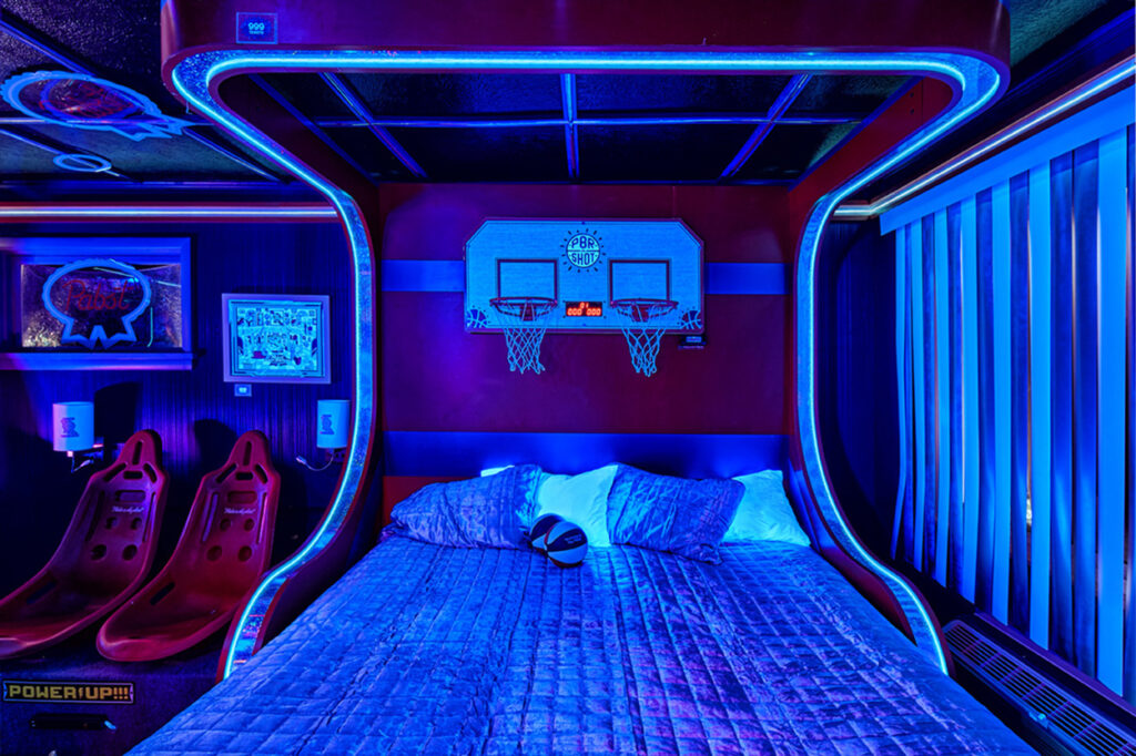
To bring our fans from a “place” in their minds to a real, physcial place, we created a one-of-a-kind Pabst motel experience, complete with three nostalgia-drenched rooms built in a mom-and-pop roadside motel in cozy Traverse City, Michigan. Each room drew inspiration from notable topres of three distinct decades—A comfy 70’s rec room, the diviest of dive bars straight out of the 80’s and a rad 90’s arcade.
The Rec Room



The Dive Bar


The Arcade


Pabst Motel Social Promos



Case Study
Rainier Beer: Rewild the Rainiers
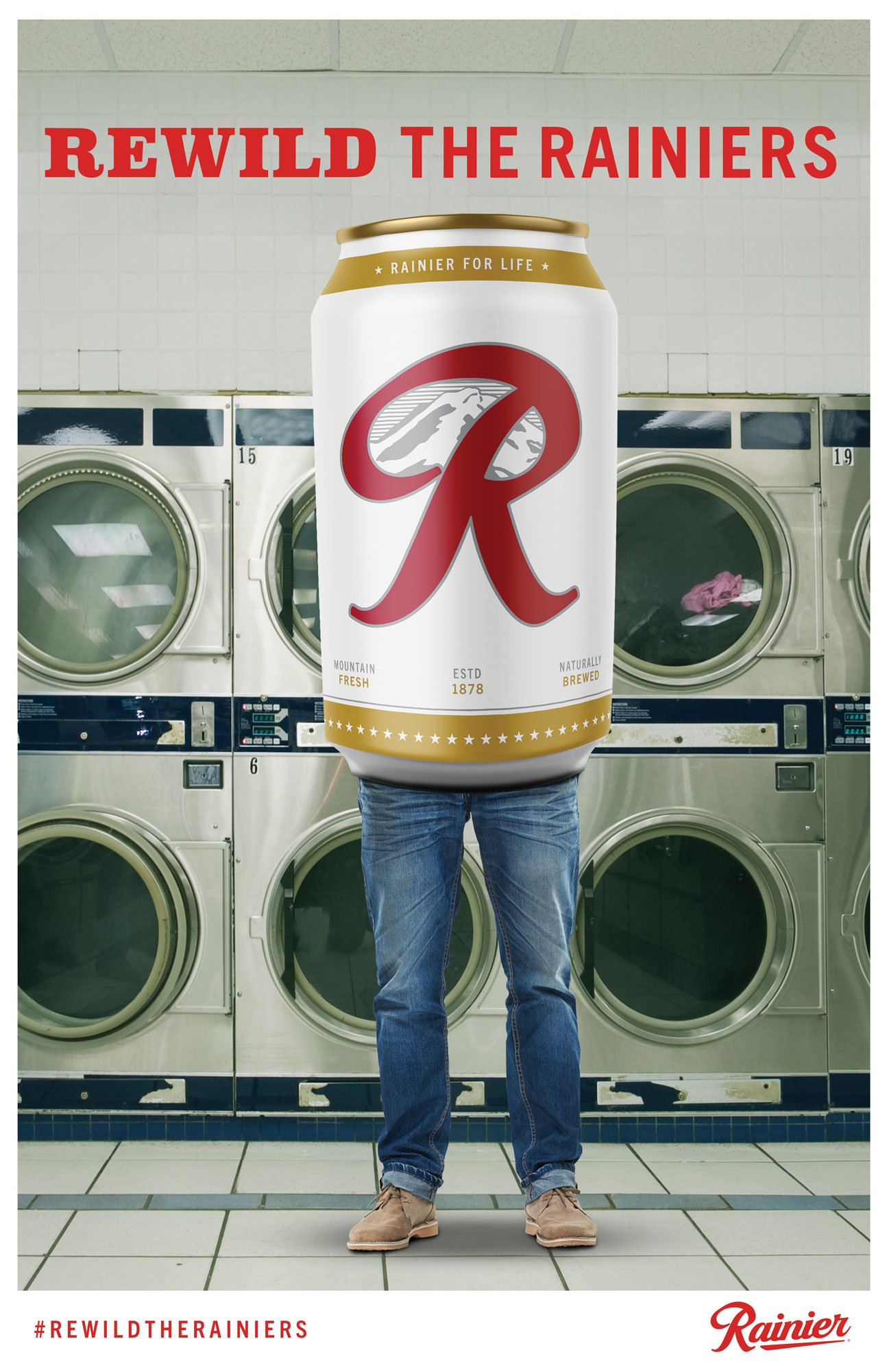
Rainier is an iconic PWN brand. A badge of honor for in-the-know locals who wear that badge with pride. From the classic “raaiiiiii-neeiirrrrrr-beerrrrrr” motorcycle ad to bottles with legs (AKA Grazers), the brand had always been memorable. But as Seattle had rapidly grown, that badge had lost its luster. We needed to reindroduce the brand and what they’re all about to a whole new audience, and that audience was overwhelmingly one key demographic—young professionals and specifically, tech workers.
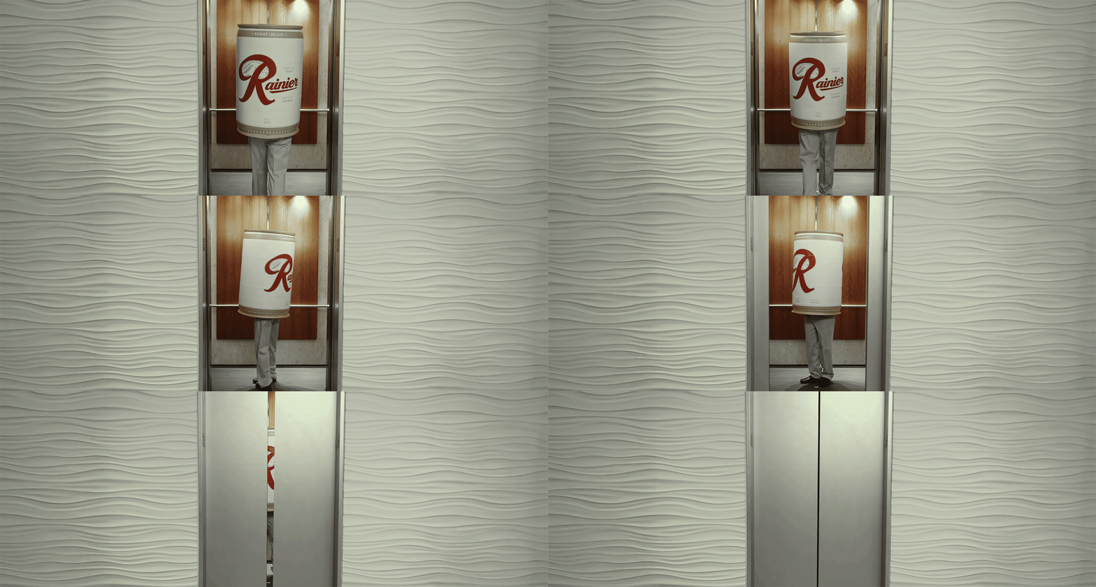
So we decided to rewind the tape and run it back, this time modernizing the Grazers as adventure-friendly cans with legs. We then contrasted the city grind with the reason anyone in their right mind would live in the PNW in the first place—nature—encouraging new Seattleites to “rewild” the Rainiers.
So we decided to rewind the tape and run it back, this time modernizing the Grazers as adventure-friendly cans with legs. We then contrasted the city grind with the reason anyone in their right mind would live in the PNW in the first place—nature—encouraging new Seattleites to “rewild” the Rainiers.
client: Rainier Beer
media: broadcast video, OLV, DTV, social, print, POS
industry: beverage
market: regional
role(s): ACD—art direction, design, production hand, talent
media: broadcast video, OLV, DTV, social, print, POS
industry: beverage
market: regional
role(s): ACD—art direction, design, production hand, talent

Point of Sale

Rainier Summit Launch: The Nest Cam

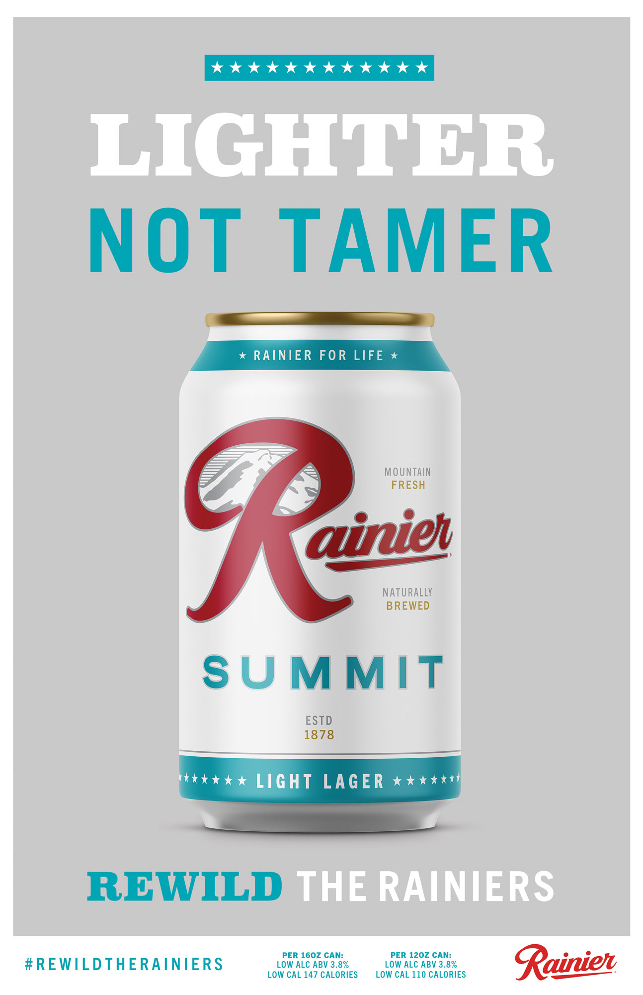
The cherry on top of the Rewilding cake was the launch of a new Rainier product, Rainier Summit: the lighter, not tamer new genus of the Rainier species. To tease the product, we created the Rainier Nest Cam, a 5 day livestreamed stunt with elements of Rainer lore, PNW culture, live fan engagement, and ultimately the hatching of the cutest little baby Summit the world has ever seen.
We then extended the Rewild spots to release the new Summit cuties to the resident herd in some really fun ways. Cheers!
Sounders FC: The Champs Return
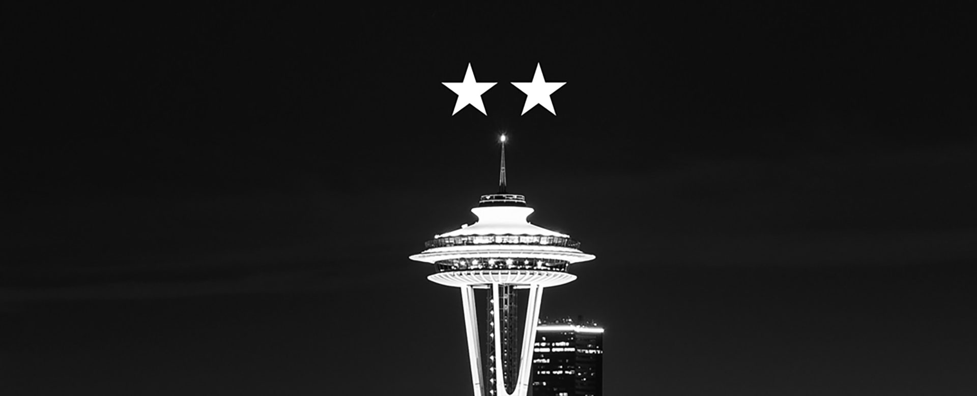
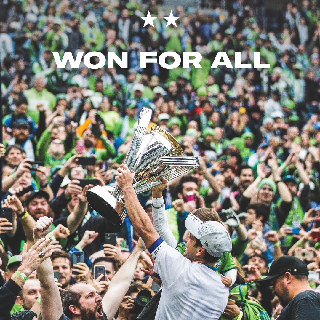
After they won the 2019 MLS Cup Championship, not only did the Seattle Sounders FC add another trophy to their already impressive cabinet, but also another star above their crest. This time around, hyping up the fanbase in Soccer City USA was simple—victory lapping, celebrating, and pulling at the heartstrings to get butts back in seats come the start of the 2020 MLS season.
client: Seattle Sounders FC
media: TV, print, web
industry: professional sports
market: regional
role(s): Sr. AD—art direction, design, diehard SFC fan, STH (SFCTID!)
media: TV, print, web
industry: professional sports
market: regional
role(s): Sr. AD—art direction, design, diehard SFC fan, STH (SFCTID!)
OOH, Wildpostings

Social



KP Thrive: The Evergreen State of Healthy
Battling for awareness and distinction in a saturated market, Kaiser Permanente needed something unique. To stand out in a sea of healthcare advertising sameness, we created “The Evergreen State of Healthy.” Through lovingly hand-crafted practical sets representing aspects of the beloved natural beauty of the PNW, we demonstrated KP’s local know-how and premium care right in locals’ backyards.
client: Kaiser Permanente
media: broadcast video, DTV, OLV, social
industry: healthcare
market: regional
role(s): ACD—art direction, design
media: broadcast video, DTV, OLV, social
industry: healthcare
market: regional
role(s): ACD—art direction, design
Orca Pod: 30
Clock Tower :15
Oyster :30
Hemlock :15